 +91 987 163 5909
PSD to HTML conversion
Responsive Website designing adds to the forte of our experts. This category of web designing entails utility oriented websites created across varied platforms. These websites are developed on the basis of provided environment. As a result, a website becomes compatible to different platforms, screen sizes, and behavior. It simply makes it easy for users to visit and read the website on desktop, laptop, tablet, mobile phones, and other devices. The website responds to the behavior of the medium is it being opened on. This is what the name itself implies. Interestingly, it does not require developers to build several websites for different platforms, making it a flexible and feasible solution for readers as well as developers.
Benefits of Responsive designs of SV Creations:
- One website for multiple platforms.
- Updates have to be done only on one website, resulting in cost and time saving.
- Website loading time is less.
- Great user experience.
- Good availability.
- Commendable customer satisfaction record.
- On time delivery.
- Generous, skilled, well-trained and certified staff.
Home
- Website development
- Website Design
- Website maintenance
- E-commerce Solution
- Graphic Design
- Search Engine Optimization
- PPC Advertisement
- PSD to HTML conversion
Latest Projects

Sun Rise Cooling
Category: Website Design
Fly Ladakh Adventure
Category: Website Design
ASWAL Associate
Category: Website Design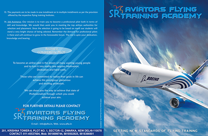

SR Aviators
Category: Graphic Design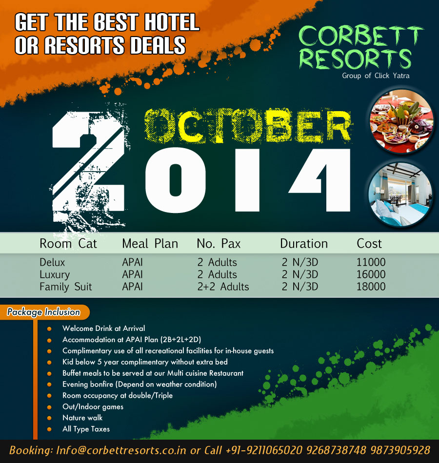

2nd Oct Banner
Category: Graphic Design
Preeti Rao
Category: Website Design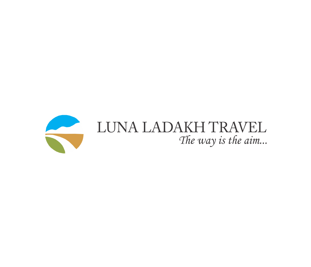

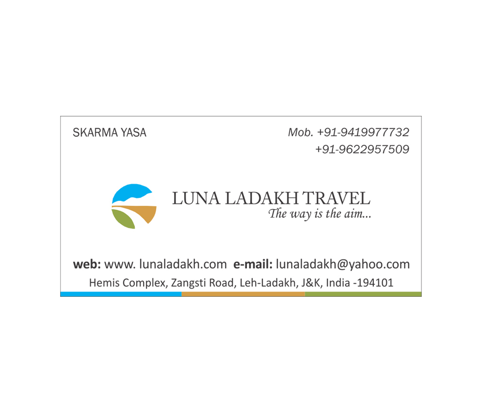
Luna Ladakh Travel
Category: Logo Design

FB Posting Banners
Category: Graphic Design
Iota Gifts
Category: Website Design
Himalayan Eco
Category: Website Design
Himachal Holidays
Category: Website Design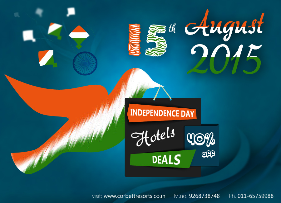

15th Aug Banner
Category: Graphic Design
Fashion Roof
Category: Website Design
Adventure Travel House
Category: Website Design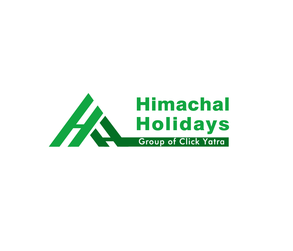

Himachal Holidays
Category: Logo Design
BIO Natural
Category: Website Design
Regalo E-Catalog
Category: Graphic Design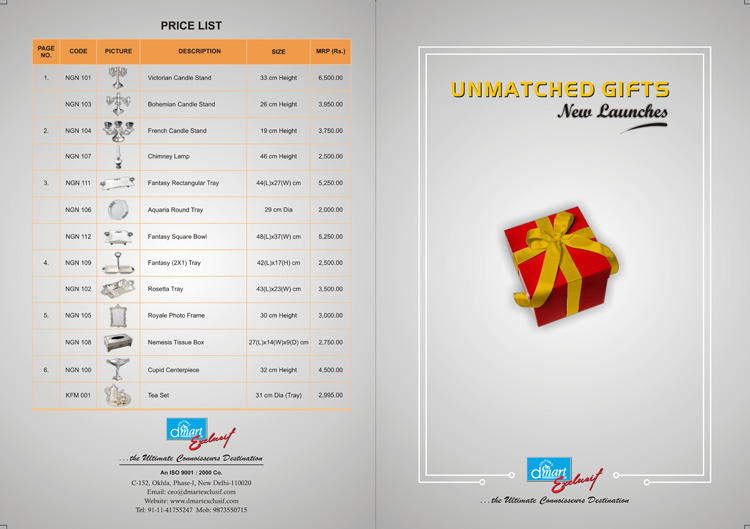

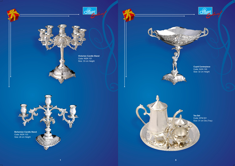
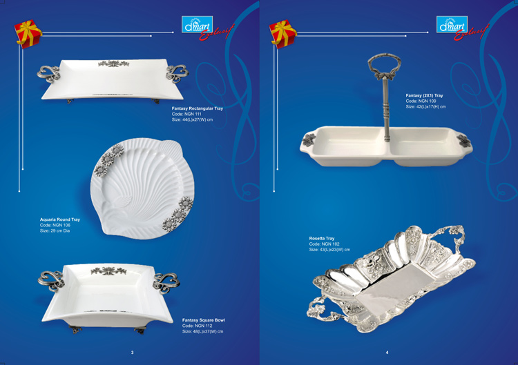
Dmart Catalog
Category: Graphic Design
Corbett Resorts
Category: Website Design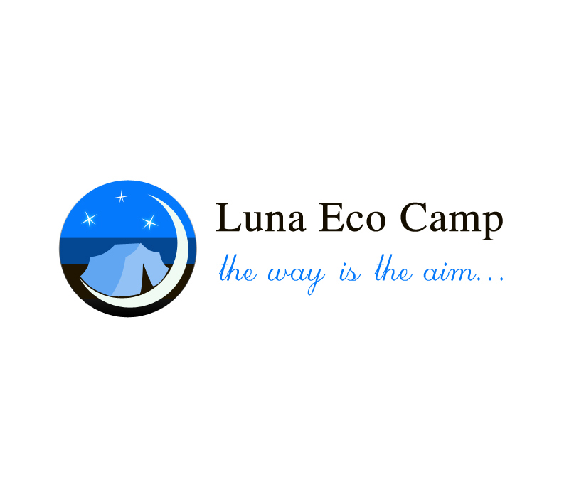
